
Forecasts
The Forecasts tab projects your finances forward in time, using your current plans and account balances to answer questions about the months ahead. The summary box at the top gives an at-a-glance overview as things stand today. The chart below it shows how your position changes over time, so you can find when a new plan becomes affordable, or how existing plans need to shift to make room for a change.
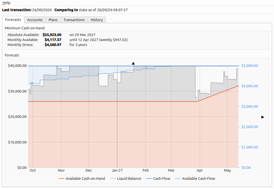
The Forecasts tab
Minimum Cash-on-Hand
The Minimum Cash-on-Hand box at the top of the tab provides a one-glance overview of the current state of your finances:
Absolute Available |
$25,923.00 |
on 29 Mar 2027 |
Monthly Available |
$4,117.57 |
until 12 Apr 2027 (weekly $947.02) |
Monthly Stress |
$4,560.97 |
for 3 years |
The table shows how tight your finances are right now given everything that you have already planned from three different perspectives. Where the forecast differs from the baseline, each figure also shows the difference in brackets; see Comparing against a baseline.
Absolute Available shows the amount of cash on hand at the lowest point in the entire forecast and when that point occurs. This is the amount you could spend right now and still just get through the tightest spot.
Monthly Available is the lowest slope from zero today to any low point ahead. This is the amount you could commit to spending every month now and still get past all the tight spots. The date given is the low point where such a commitment would leave you with nothing. For convenience, the amount is also given converted into a weekly figure. Note that the monthly available may not have an associated date at all if it is currently determined by your cash-flow rather than a low-point in your cash-on-hand.
It is important to note that these are alternative views! If you spend the entire absolute amount now, the monthly available will also become zero and vice versa. Doing either will leave you with no reserves for unexpected expenses until you reach the given point in time.
Monthly Stress is about how long things stay tight. Every low point ahead sets a limit: the cash you will have there, spread over the months until then, is the most that surprises — recurring or one-off — can average each month without running you dry. Monthly Available is the smallest of these limits. Monthly Stress is the hardest one to live with: it weighs how long the limit lasts against how small it is, because the longer the stretch and the smaller the figure, the more likely something unforeseen breaks it. Read it as “surprises must average no more than this a month for this long”. A tight month is a nuisance; the same figure for the next three years is a real constraint, since far more can go wrong in three years. The duration is deliberately rough — 1 month covers anything from three to six weeks. A dash means no low point constrains you more than your cash flow already does.
Forecast Chart
While the minimum cash-on-hand values show the state at the current point in time, the chart shows the state of your finances over time as four series. The forecast runs until every plan has fallen due at least once, and then on for a fifth as long again. Hovering over the chart opens a small read-out panel whose contents depend on the location of the cursor.
Liquid Balance simply shows the projected sum of the balances of all your liquid accounts at each point in time as determined by your plans. It assumes the worst of every day — every outgoing is paid before any income arrives — so money due in on a date only lifts the line from the next day on.
Hovering over this line shows which plans dominate the change at a given point in time and allows you to read out the exact value.
Available Cash-on-Hand is the same figure as the Absolute Available from the overview, but shown over time. It starts with the lowest value the Liquid Balance reaches across the entire chart, then runs in straight lines from one low point to the next, and past the last one rises at the cash-flow rate.
Hovering below this line provides a read-out of the absolute, weekly and monthly available cash from that point in time forward.
Cash-Flow is the sum of all your recurring liquid plans as a monthly figure. It shows the difference between your planned recurring income and your planned recurring expenses. One-off plans are ignored: this is about long-term sustainability, not whether you can survive a particular upcoming bill. A negative cash-flow may be fine for a while (say, while a holiday uses up what you saved for it), but the right-hand end of the line had better be well above zero.
Hovering over this line provides a read-out of this value as both a weekly and a monthly figure.
Available Cash-Flow is the same figure as the Monthly Available from the overview, but shown over time. Its read-out is part of the hover panel for Available Cash-on-Hand.
Note that while Liquid Balance and Available Cash-on-Hand are absolute values and use the axis on the left of the chart, Cash-Flow and Available Cash-Flow are monthly figures and use the axis on the right of the chart.
By default the chart focuses on the Available Cash-on-Hand up to the deepest low-point. You can use the ▲ button at the top of the chart to change the vertical scale to include the Liquid Balance or the ▶ button to the right of the chart to change the horizontal scale out to the end of the projection. Alternatively, you can change the horizontal scale using the scroll wheel, and drag with the left button (or Shift+scroll) to move along the projection.
Using the chart
You can use the chart both to understand your current finances better and to make changes to your plans.
To get information about your finances, you can usually just point at a spot on the chart and get relevant information from the read-out panel. For instance, if you see a big step in your liquid balance and you want to know what is causing that, you can simply point at that step and the read-out panel will list the dominant plans due on that date. If you want to know how much cash you will have available at a given point in time, point to that point in time below the available cash-on-hand line.
There are two situations that require you to right-click on the chart to read information:
The read-out of plans affecting your liquid balance only shows the most dominant plans, and sums the rest into a final …and N more row. If you want to see all plans due at a given point in time, right-click on the liquid balance line and choose “Show all in Plans tab”.
If you want to know why your cash-flow changes at a given point in time, right-click on the cash-flow line at that change and select “Explain cash-flow change”. This entry is only offered near a step in the line. It switches to the Plans tab, filtered to the plans that start or end contributing on that date; see the Plans filter.
You can also use the chart to make changes to your plans: Right-clicking anywhere in the chart opens a menu that allows you to either add a new plan at that point in time or edit any plan that is due at that point in time. Together, reading the chart and editing from it let you adjust your plans while staying within what you can afford.
For instance: you would like to plan to buy a new big-screen TV that costs $6000, but the current absolute available cash-on-hand is lower than this amount, so you know you cannot get it right away. To find the point in time where you can afford it, you point the mouse below the Available Cash-on-Hand line in the chart and move it horizontally to find the point in time when the available read-out is above $6000. Once you find that spot, right-click and select “Add plan” and fill in the details.
As another example, let’s assume you have planned a big expense several years in advance. However, due to a raise at work you now want to see if you can move this big expense forward. To do this, you start at the big step in your Liquid Balance that represents your expense and slowly move your mouse left to read out your Liquid Balance. Keep going until you find the first point where your Liquid Balance drops below the amount needed for the expense. The date to the right of that is the earliest you can move that expense to. Remember that date, right click on the big step, select your expense from the list of plans and change its due date to the date you found.
Comparing against a baseline
Everything on this tab compares the current forecast against the selected baseline. The baseline is set on the History tab via Compare to. By default it is the state when the app was started, so immediately after launch no changes are shown until you make a change or select a baseline.
The chart shows the baseline as a second, dashed line in the same colour as the line it belongs to, for Available Cash-on-Hand, Cash-Flow and Available Cash-Flow. Liquid Balance has no baseline.
The summary box above the chart, and the chart’s Cash on hand and Cash flow read-outs, put the difference in brackets beside each figure.